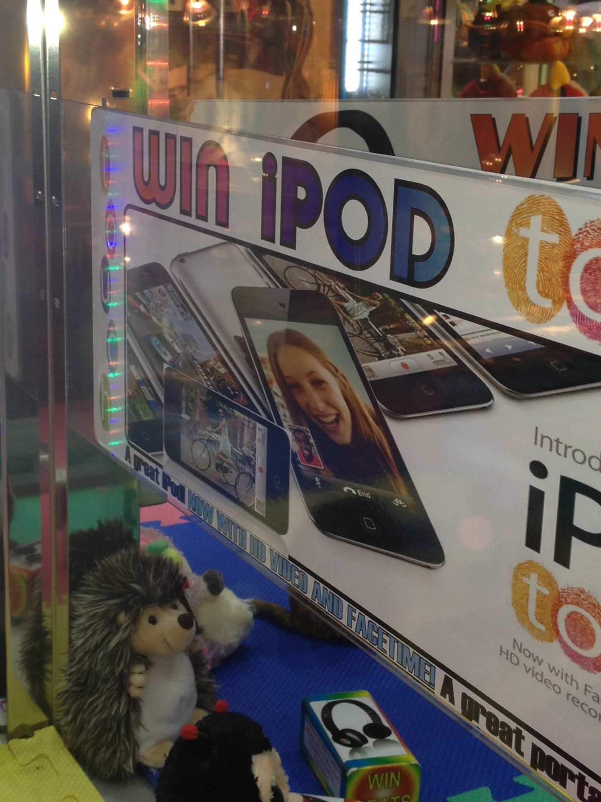
 My 7 yr old son is obsessed with the “claw” arcade game. He really believes he’s going to win the stuffed animal, the ball, or yes the iPod Nano. Recently, while I watched him try again at an arcade in Universal Studios Florida, the machine, contained Apple items, but I didn’t get the feeling they were real Apple products. Why? Because the large poster wrapping around the “claw” machine didn’t look like it came from Cupertino.
It’s not like you don’t know how Apple is supposed to look, clean centered typography, open layout and balanced use of white space.
Unfortunately, some businesses don’t get it…throw in different fonts, colors and mix up graphic elements. The result is a poor interpretation of a brand, that doesn’t really communicate at all. The irony here — the more graphics added, the less it looked like Apple.  And the less I trusted the game.
Every brand has standards written for design consistency, but you can’t police the world of bad design. This goes on all the time and just adds clutter to an already cluttered world.