
 Paula Scher really doesn’t like it, doesn’t want to acknowledge it and doesn’t want to hear it… but she created one of the most iconic album covers of all time. Art intersects music with a dash of technology. So where did that whole Boston space look come from? Paula Scher. Yes, the same person who’s won hundreds of design awards, is a partner at Pentagram, and educator at the School of Visual Arts. In the world of graphic design, Paula Scher is known for creating unique typographic artwork. She designs posters so bold, you want to read it all…at every angle. So when you look at some of her work, the Boston album cover doesn’t exactly come to mind.
As the Art Director at CBS Records in 1976 the assignment to create a cover for a new band called Boston eventually fell to her. Lots of versions had been rejected by the band based on puns using lettuce or cream pie with the word Boston attached to the image.
Can you imagine Boston being represented by cream pie? Yeah, me neither.
Band founder, guitarist Tom Scholz wanted the cover to be tech-like, as he was an MIT grad and product engineer at Polaroid. It was Scholz who recorded most of the tracks in his basement creating the eclectic-full Boston sound–a sound I’ve really never heard another band duplicate. He’d suggested a cover with a guitar shaped spaceship. Not exactly something you can get your mind around. And Paula Scher in her own words “thought the idea was idiotic.” Since it didn’t make sense they tried to tie it to a story…the earth had blown up and space ships were escaping into orbit. There were supposed to be many guitar–city–spaceships leaving the planet labeled, London, Paris, Rome, and Boston was supposed to be the largest escaping front and center. OK the idea is far-fetched, but it’s rock n’ roll. Eventually they took out the other city names to avoid confusion and just kept one city, Boston.
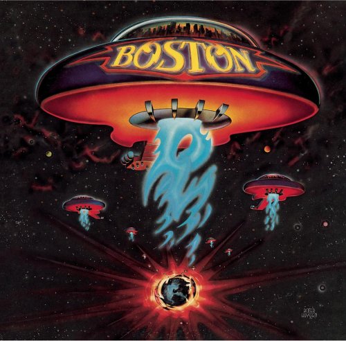 The label, Epic had high hopes for the band, and the album exceeded expectations. It’s the second best-selling debut album of all time. 20 million copies sold. And the album cover, simply iconic. Paula Scher doesn’t care for their music and doesn’t want to be known as the woman that created the album cover. But Paula, c’mon, it’s a great little ditty on a resume.
That album cover went on to influence future techies and software for decades. Lots of 3-D color blends and stylistic elements in design came from that album cover. As Paula Scher mentioned in her book Make it Bigger “I’ve often thought that the entire point of computer programs like (Adobe) Illustrator and Photoshop, based on the way they are advertised, is to enable anyone to create their own Boston cover.” She has a point. Photoshop likes to show lots of smooth 3-D gradient blends that you can do yourself.
Paula Scheer acknowledges that being known for this assignment has opened doors “…so I mentioned I was art director of the first Boston album cover. I felt a hush of reverence permeate the room. I was given the assignment.”
Rock on Paula.
Source; MAKE IT BIGGER, Paula Scher, Copyright 2005


Pingback: Dean Y
Pingback: Andy Onomis
Pingback: Ed
Pingback: Jacen
Pingback: George Armstrong
Pingback: danieledwardssite
Pingback: Michelle (@stellawriting)
Pingback: Anton Nym